


Role: Consultant + Web Designer, with a UX mindset
The product already existed . . . I just had to show the stakeholders how it could be improved.
I actually just wanted to teach a few Pilates classes at the Mill while I was home, but since they switched locations, I became curious about how the business had branded itself and what their website looked like. The website demonstrated an information overload, no information architecture and, after asking several users and potential gym goers what they felt when using the site, they expressed feeling “intimidated”, “confused”, “overwhelmed” and that they wanted to leave the site without seeing more.
In order to get the creative juices flowing and show this local business I really cared about their success, I got to work at showing how, from the competitive and qualitative research I had done, plus my extensive experience in the fitness industry, their business model could be improved and what aspects of the website were possibly hindering The Fitness Mill from attracting new clients. I formulated the brainstorm in a way that made stakeholders excited to participate and add ideas.
I wanted to visually show any disparities between The Fitness Mill’s intentions and actual execution.
Problem
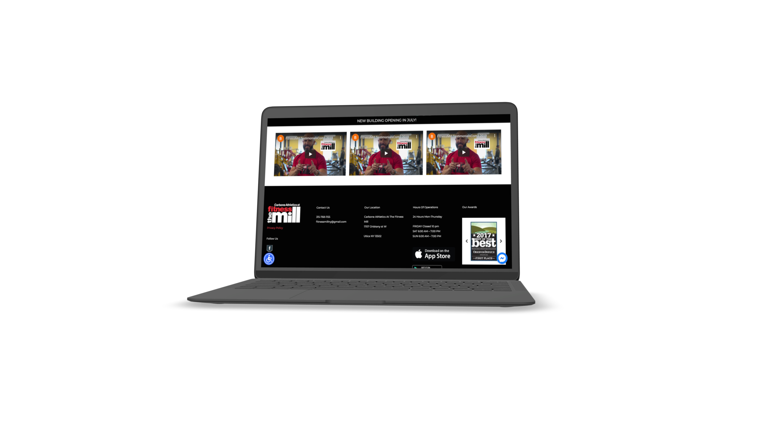
The Fitness Mill, a very popular local gym, had a website published that wasn’t reflective of the facility’s offerings and amenities. The website had zero information architecture and while the color choices were on-brand, they didn’t add any benefit to the overall usability of the site. There was also the use of video on the landing page, which made the page feel chaotic.
Locals were confusing the new gym location with the LiveIt downtown brand, which is the complex in which the Fitness Mill is now located.
Recently, the gym switched locations after being in an old, brick Mill for many years. Since moving locations, the website no longer reflected the offerings and brand of the new facility. As a UX designer, digging into the website, why it should exist and what the new location is most proud of exposed that the Mill wasn’t showcasing its greatest features. The vibe of the website was rugged and for some, intimidating, when in reality, the actually facility has something for everyone.
Its brand also had too much of a similar feel to the LiveIt downtown complex ( its new location), a client I began working with as a result of this discovery.


Audience
Athletes, gym goers and potential gym goers aged 5-99 years.
The fitness sending a message that was alienating certain users, which was not the intention. At first glance, the facility seems primarily devoted to powerlifting. While a lot of members and staff DO love powerlifting (and there’s incredible programs dedicated to this sport), there wasn’t enough emphasis on the other qualities of the gym.
The Fitness Mill offers an extensive variety of group fitness classes, has amenities that are very unique to the Utica area, has highly credentialed trainers and a shake bar, but based on the site, you wouldn’t know this.
The audience is quite literally anyone who plans on going to the gym, using a personal trainer and enjoys a spa-like experience. The programs at The Mill offer something for everyone, including powerlifters, yogis, HIIT and cardio-lovers, dancers, Zumba fans, functional training movers (TRX, Jacob’s ladder), athletes with varying ranges of abilities (special-education instructors in-house), those seeking one-on -one coaching, serious Jujitsu athletes (and beginners), runners (there’s an indoor track) and those looking to have space to do their own training (the place is gigantic).
Constraints
Money was the biggest constraint of this project. Through the two brainstorming sessions I organized with the stakeholders, I was able to identify their biggest priorities:
Website
. . .This was pretty much it.
As a UX designer, I knew that more needed to be addressed, based on the past website and how our brainstorming session went. There was a lack of clarity in what was driving the profit, brand identity strength, the message being communicated amongst all platforms and prioritizing content on the site.
I asked around 10 people in-person about their perception of The Fitness Mill; This was a tricky task, because in a small city, everyone knows everyone. I tried to ask people who I thought were least likely to already be a member.
As I anticipated, 100 % of the people I asked thought the new gym was called LiveIt Downtown and that it was a place to go if you’re a powerlifter. While there’s a big emphasis on accessibility, which I loved, there were some bridges that needed to be built between intention and presentation.
After watching the home page video for around 30 seconds, I noticed how inclusive the gym is. However, some sources say that the average time spent on a website can be as low as 15 seconds. Since the video is actually interrupting what the user might be on the site to do, this could potentially add to user frustration.

I didn’t have the resources to conduct full-on user interviews, so instead, I used my ongoing competitive research. As a fitness professional and entrepreneur living in NYC, I am quite literally always conducting research, have worked out at well over 20 different gyms in the nation and have taken class 3-6 days a week for 25 years of my life. Even though I would never say I know what the user wants, I can say for sure I know what works and what that looks like.
I also contracted a Data Analyst who is a master at finding facts, numbers and clear cut information and explaining it in laymen’s terms (I learned a ton from working with him). With an extensive background as a personal trainer, math whiz and entrepreneur, he really helped me make a solid case in a way that combined my creative vision, research and experience with cold, hard, profit-generating facts. Intuition is important, but it means nothing to a stakeholder without a solid explanation.
Process
As I mentioned above, I started by brainstorming with the stakeholders. I wanted to build trust by building a case, free of charge, demonstrating that I understood and respected the product, business, employees, facility and potential goals of The Fitness Mill. I wanted to anticipate their wants and needs as much as possible, while leaving plenty of room to be completely wrong. The most important question I asked them was, “Why do you need a website?" There was at least 10 seconds of silence. Then the ideas starting flowing.
In case you missed it, here’s the brainstorming/flow session that I completed with my data analyst and a few, unbiased, generous friends prior to the meeting.

I then took everything that was gathered at the brainstorming session, including a ton of notes from the stakeholders, in order to pitch a few design packages that were created uniquely for The Fitness Mill.

I am not a sales person, but prefer to connect via genuine interest and collaboration. So, I wanted to be completely transparent and predictable in what I was offering, tailor it to The Fitness Mill specifically (not just copy and paste) and create value so that no matter what option the stakeholders chose, they would walk away feeling amazing, rather than like they settled or were missing out by choosing a less expensive option.
I was able to put the LiveIt Downtown site and The Fitness Mill as a bundle, because the owner is actually the same. He opened up the LiveIt Complex in order to spruce up the downtown Utica area and offer a place for local businesses to live and offer convenience to the members of his gym.
The stakeholders ended up choosing The Power Duo.
I was also able to get the Data Analyst a gig to strengthen the overall impact of the work I had done and offer more clear data for business strategizing. They purchased a package that would allow Angel to analyze and organize the data from their previous website, as well as in the physical business, in order to create a baseline for measuring improvement.

Once the idea was approved, I got right to work.
It was very important to me to create architecture and highlight what The Fitness Mill felt their biggest selling points were.
Personal Training
Unique Equipment
Space
Something for everyone (community)
Amenities

I was able to create a stronger sense of clarity of what the stakeholders wanted on the site and why by jotting down everything about the Mill, then creating more broad categories for all of these ideas. If I couldn’t find a home for something, I evaluated its importance.
In order to convey the message we all agreed on, I decided to include these things on the site to reflect how amazing the gym is:
Trainer/Group Fitness Instructor Headshots
Trainer Bios/ Instructor Bios
Highlighting trainer credentials
Photos of the Space
Featured programs from the perspectives of the directors of these programs
Unique Equipment photos
Welcoming language
Diversity (Appearance, movement, size, etc.)
Photos that correspond with classes
A user-friendly interface
Easier-to-read color combinations
Progressive dislosure
A description on why someone should be interested in the available amenities
Finding some distinction between LiveIt and The Mill (pertained more to LiveIt site, actually)
I also knew that the website would be the most impactful for potential fitness mill members, so it needed to operate as if the visitor knew absolutely nothing about the business. Once a member, there’s not a ton of incentive to use the site (I wanted to create more reason, but I’ll touch on that in a bit).
The fitness director also happens to be a photographer, so I scheduled a photoshoot and created a checklist of all the things he needed to capture in order to really hone in on the above ideas, including headshots and amenities. Due to lack of time, I also integrated professional photos that I had access to on Squarespace, but hopefully will be able to add more photos from Eddie, or change the design in order to make it completely original to the Mill.

I structured the website from the perspective of the user, focusing on the most immediate things I’d want to know and putting the rest of information a little deeper into the website, while incorporating the stakeholder’s main objectives of having a site.

I also edited the headshots to be gray-scale, in order to diminish flaws and create a sense of unity and team.

The writing and descriptions I chose were meant to highlight the strong sense of community that exists at The Fitness Mill, be very easy to read, but catchy and provoke the user to continue navigating the site, while also making it very easy to backtrack.

The option to sign up is the first thing you’ll see, then the amenities. I also wanted to do a bit of research to determine why you would want to use these amenities, rather than just stating that they exist, creating value and demand, rather than just supply.

The stakeholders mentioned that they couldn’t get their trainers to be motivated enough to send in bios when they’ve asked, so I created a template to encourage the coaches to get excited to talk about themselves and their passions.

On the previous site, the classes offered were listed.
I wanted to offer a visual of what the group fitness classes are like.


Impressions
In the end, the website was everything the stakeholders wanted, even though I wasn’t totally satisfied.
Some things I wish I could have addressed, pertaining to the website and in general, are:
Group fitness photos to express a feel and look of what class goers could expect
Online profit generation
App creation
Less membership options
Brand identity across platforms
Incentivizing gym visits
A method for front desk staff to create an atmosphere
Gym Aesthetic (lots of blank walls, awkward layout)
I actually went in to the gym, knowing no one would know who I was, and purchased a day pass. The price was $15 for a day pass and no one asked if I knew where anything was or gave me any other information. This, in my opinion, would be a turn-off to a potential member. This gym is high-end and those who are on the front lines will definitely leave an impression.
Listing group fitness classes, without expressing the energy of the class, will likely lose a user’s interest and create a barrier for potential class goers.
In the age of the pandemic, it’s becoming exceedingly common for fitness businesses to offer on-demand classes or virtual training. I would have loved to help the company launch this, beginning with free, one to three minute exercise tutorials for those who lack the confidence to use equipment or workout in front of others (the layout is very open and you can see everything and everyone). Free content almost always generates sales, especially when it comes to tutorials. If you don’t have it for free, a user will just go somewhere else.
So many people move and relocate, so offering virtual services can expand your reach astronomically. The Fitness Mill sells apparel in-house, so it has the potential to generate more sales if the apparel was sold online. It would have even more potential if they created a platform for local artists to submit their work and offer limited addition, small batch items. Utica loves local collaboration.
The social media content that is being produced lacks consistency and is a bit too sales-oriented. Rather than accentuating value it accentuates price. The videos are also a bit too long (3+ minutes) to convey ideas that should be brief and are sure to lose the user’s attention.
There are about 15 membership options available that is likely to create a paradox of choice. Simplifying the memberships would create more safety and incentive for a potential member.
There’s no clear option to schedule a gym visit and the gym is absolutely stunning. I do believe that implementing a system where an individual can schedule a tour and count on someone to be there to help would increase membership sales.
I would love to, in the future, be able to invest more time and money into confirming or refuting the above hypotheses.
I am so grateful I had the opportunity to collaborate with a successful local business. Fitness is an area of passion for me, as is shopping local. Being able to build a relationship and trust with the owner and directors was very meaningful to me and I really hope I get to work with them again in the future.
The most important lessons I learned from this project are:
that there’s always a way to get the work done, regardless of constraints
find a common ground
Not every idea needs to take root
actively listen
prioritize
perfect is the enemy of good.